Goled
Familiar colours. Fresh brand energy.
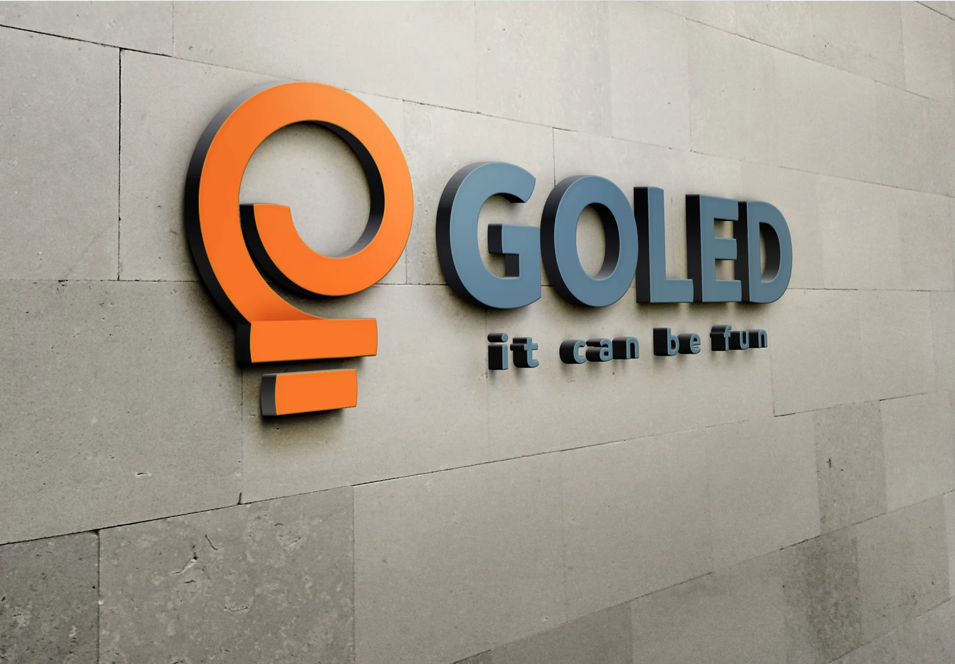
A new expression that customers still recognise.
LED lighting retailer Goled wanted a more contemporary, friendly and upbeat identity. Orange and grey needed to stay: they were established parts of the brand. The 2020 logo redesign followed a longer e-commerce collaboration, placing the change in the context of the wider customer experience.
Colour as a point of continuity
Keeping the corporate colours gave the design a clear frame. The renewed character therefore came primarily through typography, form and logo composition. The brand could feel fresh while retaining a visual connection to what customers already knew.
Character starts with the lettering
The identity work included typeface research, composition studies and final artwork. I explored how to combine a contemporary expression with the approachable feel in the brief. The finished logo uses a simple, distinctive wordmark and the contrast of familiar colours.
The identity in a shopping context
The separate e-commerce work covered categories, product details, checkout and customer accounts. When more detailed category content was requested, I first clarified its scope and purpose with the client: what the page should explain and which decision it should help people make. That attention to function connects my work on the website and the identity.
WHAT THE WORK ENABLES
The redesign gave Goled a new logo while retaining its familiar colours. Together with the e-commerce work, it reflects a long-term approach to the brand: from first impressions to the information customers need when shopping.