Pijeme.sk
A brand that lives online and on the streets.
A mobile catalogue needs its own logic.
The Bratislava delivery service needed consistent communication and a clearer product range. During the 2015 redesign, the long catalogue showed why a desktop layout could not simply be shrunk onto a phone. The way visitors reached the products needed to change.
From one long page to clear categories
The initial idea used one long list with jumps between sections. I proposed separate category pages. We chose that direction after discussion: visitors could reach a specific product group without moving through the entire catalogue.
Responsive by design
I adapted product layouts and the expanded menu for mobile. Main navigation and category navigation used contrasting colours to remain distinct when adjacent. A readable body typeface complemented the brand’s more expressive lettering.
One brand across every touchpoint
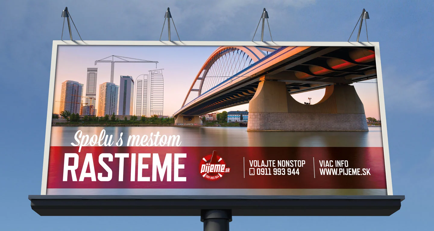
The website built on ongoing work across the logo, business cards, leaflets, billboards and campaigns. The service needed to remain recognisable on a screen, on a printed offer and in street advertising.
WHAT THE WORK ENABLES
The design changed the catalogue structure, mobile interface and navigation clarity. The broader collaboration connected the digital service with a distinctive brand presence in Bratislava.