iDNES.cz · Lidovky.cz · Esprit
Three distinct brands. One shared foundation.
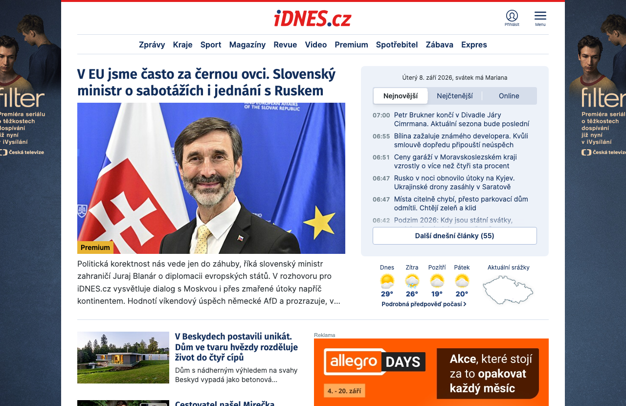
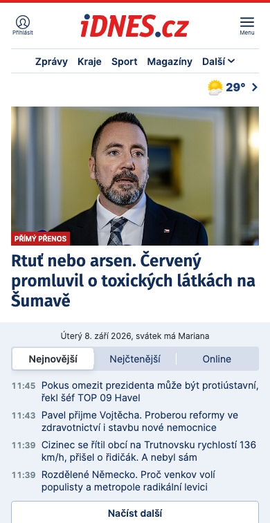
One shared system for three distinct brands.
A news portal, an opinion-led newspaper and a lifestyle magazine each need their own expression and reading rhythm. Beneath that surface they solve similar problems: headlines, articles, navigation and different screen sizes. My work on iDNES.cz and Lidovky.cz established a shared foundation that later supported Esprit. The challenge was to extend the system while preserving each brand’s character.
Colour has a role in the interface
A component does not simply use “white”; it uses the role “text on a coloured background”. The brand and light or dark mode determine the value. This semantic layer separates a colour’s purpose from its value. Dimensions and typography follow the brand and screen size. Changes happen through connected variables instead of recolouring and rebuilding every instance by hand.
Esprit: room for photography, its own settings
For Esprit, we first explored a clean, light setting that would let photography stand out. The design evolved: the final development handoff introduced a teal palette, warmer neutrals and corner radii for desktop and touch interfaces. The magazine’s character came from adapting shared rules. A responsive prototype helped assess width and proportions before implementation.
The system has to reach development
The work also bridges Figma and implementation. During the library refresh I documented changes and mapped variables to development naming. We worked through colours, spacing and radii, agreeing on a gradual transition: new designs could adopt the new library while existing documents would be connected deliberately.
WHAT THE WORK ENABLES
A shared design system connects iDNES.cz, Lidovky.cz and Esprit while preserving each website’s character. The work also produces rules, documentation and a verified export of variables to CSS. Future designs and developer handoffs can build on a library that continues to evolve.